전시 EXHIBITION
개인전女子의 變身은 無罪
-
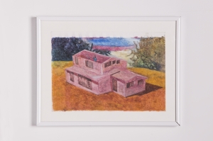
女子의 變身은 無罪 no. 1
-
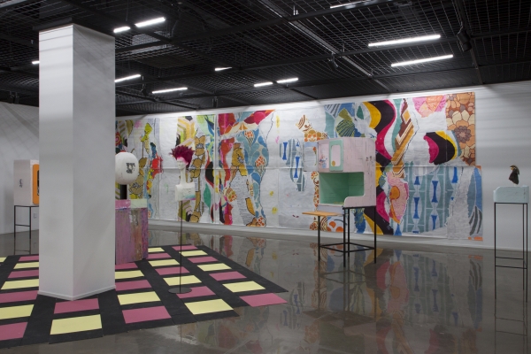
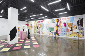
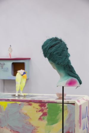
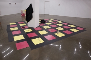
전시전경
-
女子의 變身은 無罪 no. 4
-
전시 전경
-
女子의 變身은 無罪 no. 1
-
전시 전경
-
女子의 變身은 無罪 시리즈 no. 2
-
전시 전경
-
女子의 變身은 無罪 시리즈 no. 2
-
女子의 變身은 無罪 시리즈 no. 1
-
女子의 變身은 無罪 시리즈 no. 2
-
女子의 變身은 無罪 시리즈 no. 4
-
女子의 變身은 無罪 no. 1
-
女子의 變身은 無罪 no. 1
-
女子의 變身은 無罪 no. 1
-
女子의 變身은 無罪 no. 3
-
Drawings
-
Drawings
-
Drawings
-
女子의 變身은 無罪 no. 3
-
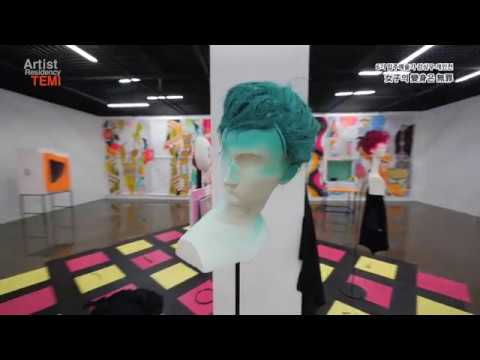
강상우 개인전 영상
본 전시는 2017년 평화문화진지 개관 그룹전 APT 1탄 의 한 섹션에서 열린 80년대 여성정장 파트 1의 후속전시이다. 1980년대 TV광고 속에서 발견된 환상적 여성상과 그와 배치되는 억압적 현실들에 주목하고 해당 광고의 이미지와 문구들을 차용한 입체, 설치, 페인팅 작업들을 통해 당당하고 독립적인 여성상을 호소하는 움직임, 그리고 반대로 그것을 위축시켰던 당시의 사회적 단상들에 관해 다룬다.
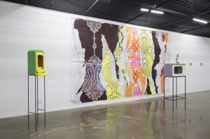
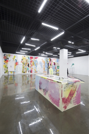
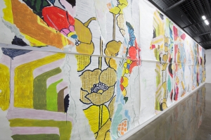
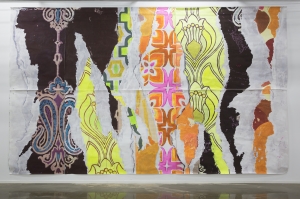
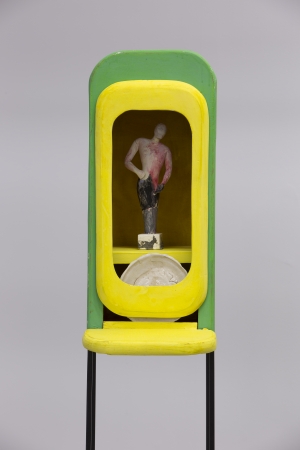
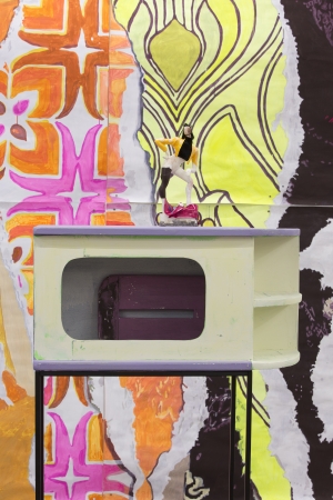
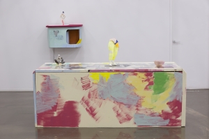
여자의 변신은 무죄 의 전시 공간은 가정 주방의 형태와 색 조형을 참고하여 연출된다. 프랑스의 패션 디자이너 이브 생 로랑 이 전 세계적으로 유행시켰던 1970~80년대의 여성복 패션을 연상시키는 소형의 조각 작품 10여 점과 당시의 주방 가구 디자인의 좌대 7점, 그리고 실내 벽지 디자인들을 꼴라주한 대형 평면작업과 바닥타일 작업 등으로 구성된다.
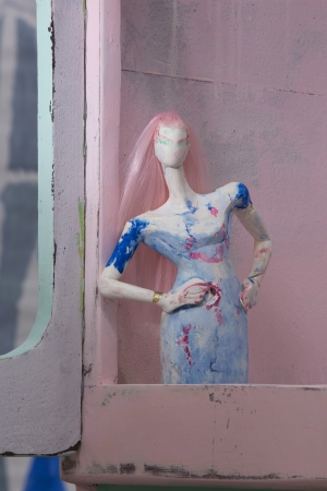
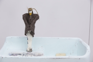
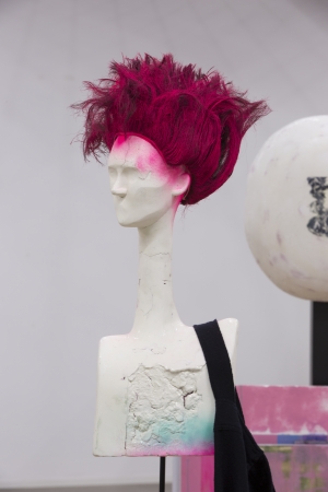
독립적이고 중성적인 여성상을 상징하는 매체로 당시에 유행하던 패션정장 스타일의 장식을 착용한 당당한 포즈의 여성형태 조각 작업들이 선보여진다. 그것들과 대척 점에 위치하는 동시대의 순종적 여성상의 상징물로서 주방 가구모양의 좌대들과 식기 등의 기물들 속에 전자의 조각 작업들이 구속된 듯한 모습으로 설치된다. 대형 평면작업 역시 가정적 분위기의 화사한 색감과 무늬를 가진 실내벽지의 꼴라주 집합체 이지만 찢어져 훼손된 모습으로 재현됨으로써 스산한 정서와 함께 당시 복종적, 순종적 여성상의 어두운 현실을 상징한다.
이러한 전시공간의 연출은 ‘여자의 변신은 무죄’, ‘20대 여성의 자기주장’ 등 80년대 여성정장 광고 카피 등을 통해 호소되었던 환상, 즉 당당하고 중성적인 여성상이 한편으로는 ‘며느리는 또 친정에 갔나’ ‘브루펜 약 먹고 술상 차려’ 등의 동시대 또 다른 광고들에서처럼 억압적인 현실 속에 구속되었던 총체적 현장으로 관객들에게 감상되도록 유도한다. 위의 대사들이 삽입된 실제 광고들을 편집한 사운드 작업은 전시장의 구석에 위치되어 해당 주제의식을 강조한다.
나는 본 전시를 통해 80년대 유년시절에 해당 TV광고를 보며 성장해온 성인으로서 당시 여성의 이미지에 관련된 여러 상징들의 차용과 열거로 펼쳐진 작업들을 통해 그 당시에도 현재에도 너무나 당연하고 의심의 여지가 없어야 할 명제인 ‘여자의 변신은 무죄’ 가 단지 허울뿐인 환상인지 유효한 실제인지에 관해 반성하고자 한다.
-
현실과 예술의 접점에서
홍태림(미술비평가, 크리틱-칼 발행인)
《女子의 變身은 無罪》는 강상우가 1980년대 전후를 가로지르던 환상적 여성상에 대한 의문을 조형언어로 포착하는 과정에서 만들어진 전시라고 볼 수 있다. 그렇다면 강상우는 그러한 과정을 어떠한 태도로 임했을까. 이에 대한 나름의 답을 적어보기 위해서 우선 이번 전시에 포함된 작업 몇 가지를 언급해보도록 하자.
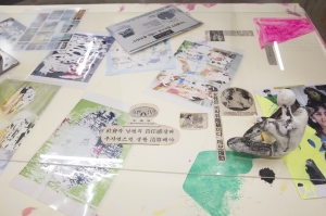
먼저 전시장의 중앙을 약간 벗어난 곳에 있는 아카이빙 책상을 살펴보자. 이 책상에는 여성상 작업과 세라믹 작업이 한 점씩 올려져 있고 네이버에 뉴스라이브러리에서 1980년 기준으로 ‘여자의 변신은 무죄’, ‘20대 여자의 자기주장’ 등의 키워드로 검색했을 때 나오는 기사 및 광고 그리고 핀터레스트(pinterest.com)에서 검색한 1980년대 여성패션과 주방가구에 대한 자료도 진열되어 있다. 한편 이 아카이빙 책상에서 확인할 수 있는 자료들 중 일부는 프레임 작업과 대형 회화작업 그리고 여성상 작업 및 두상 작업에 틈입하기도 한다. 따라서 아카이빙 책상은 이번 전시에서 일종의 참고문헌 역할을 수행한다고 볼 수 있다.
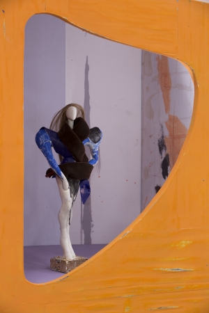
다음으로 살펴볼 작업은 여성상 작업과 두상 작업이다. 이번 전시에서 강상우가 참조한 1980년대 전후의 여성패션은 남성복 디자인을 여성복에 적용하여 당당하고 독립적인 여성상을 표현한 스타일과 관련이 많아 보였다. 예를 들어, 여성상 작업들은 이러한 스타일에 해당하는 의상을 착용한 모델들의 포즈를 참고한 것이어서 상체까지 표현된 경우에는 어깨가 역삼각형으로 벌어졌다는 특징이 있다. 다만, 여성상 작업들에 포함된 의상들은 이러한 남성적 스타일에 관련된 것은 아니고 1980년대 주방가구들에 고려된 색감이나 여성상들의 조형적 완결성과 결부되었다. 한편, 두상 작업들은 1980년대의 남성적 여성 헤어디자인과 여성상 작업의 경우와 동일한 방식으로 고려된 색들이 사용된 것을 어렵지 않게 알 수 있다. 이와 같은 특징과 관련성을 가진 여성상 작업들과 두상 작업들은 석분점토가 사용되었다는 점에서도 공통점이 있다. 두 작업에서 석분점토는 스티로폼 뼈대에 부착되어 모양이 잡힌 후 사포로 연마하는 작업을 거치게 된다. 그런데 석분점토를 연마하다보면 뼈대에 해당하는 스티로폼이 외부로 노출될 때가 간혹 생기기 마련이다. 이런 상황이 발생하면 강상우는 그 스티로폼을 파낸 후 빈 공간에 석분점토를 채워 넣고 다시 연마하는 작업을 이어나간다고 한다. 이러한 과정을 거치게 되면 기존의 점토와 새로 추가된 점토가 굳는 시점이 어긋나며 우연적인 균열이 발생하기도 하는데, 강상우는 이러한 우연성에 많은 관심을 가지고 있다. 그 이유는 3차원으로 구현된 석분점토의 표면에 발생하는 균열이 필연과 우연이 미묘하게 뒤섞이는 회화를 연상케 하는 측면이 있기 때문인 것으로 보인다. 사실 이러한 작가의 관심은 석분점토 표면에서 드러나는 균열뿐만 아니라 여성상 작업에서 컬러콩테가 사용된 방식이나 얇게 떠낸 아크릴 물감을 여성상의 의상으로 표현한 경우에서도 잘 드러난다. 즉, 강상우는 석분점토를 3차원으로 다루면서도 그 3차원의 표면 위에 회화적 특성이 어떤 때에 어떻게 틈입할 수 있는지를 탐구하고 있는 셈이다.
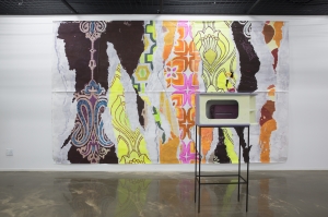
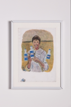
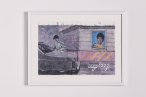
여성상 작업과 두상 작업 다음으로 언급해볼 작업은 이번 전시에서 적지 않은 비중을 차지하는 프레임 작업들이다. 1980년대 전후 국내외에서 유행했던 주방가구 디자인들을 재해석한 프레임 작업들은 표면에 드러나는 색의 보색들을 외벽에 먼저 칠한 후 적절히 연마하여 불명확한 노스탤지어(nostalgia)를 발산한다는 점에서 묘한 기분을 느끼게 한다. 또한 이 작업들은 여닫이문이 접착제로 고정되었으며 아래로 당겨서 열면 선반이 생겼어야 할 부분은 그냥 철체 프레임에 수평으로 고정된 경우에서 잘 드러나듯이 약 30년 전에 유행했던 주방가구들의 기능성까지 참조하지는 않았다는 특징도 가지고 있다. 한편, 프레임 작업들의 외벽에는 츄잉껌 ‘내친구 덴버’의 빛바랜 스티커가 연상되는 인물들이 전사되어있다. 이렇게 전사된 인물들은 사실 전시장 한쪽에 여성에 대한 사회적 차별이 녹아 있는 1980년대 광고 소리가 흘러나오는 프레임 작업에 등장하는 인물들이다. 이 중에서 압권은 부루펜 광고다. 이 광고는 남성 직장동료들을 집에 끌고 온 남편이 아픈 아내가 이불 밖을 나오지 않자 난처해하는 상황으로부터 시작된다. 술상이라도 차려줘야 할 아내가 요지부동이자 남편은 동료들에게 아내가 아프다며 투덜거린다. 그러자 직장동료들은 느닷없이 부루펜을 추천하고 부루펜을 먹은 아내는 원기를 회복하여 주방에서 소비자들을 향해 미소를 지으며 “참 좋아요!”를 외치기에 이른다. 이 광고는 남편이 아픈 아내를 보채기만 할 뿐 자신이 주방에 들어갈 생각은 하지도 않는다는 점과 그런 태도를 당연하게 생각하고 부루펜을 건넬 뿐인 남성 직장동료들 그리고 그 모든 것을 내면화한 아내의 “참 좋아요!”란 외침을 아우르며 1980년대 한국사회에 만연했던 성차별의 한 단면을 잘 드러낸다. 그리고 이러한 측면은 전시장 구석에서 조용히 흘러나오는 다른 광고 음성들에도 은밀하게 내재되어 있다. 그런데 이러한 소리들은 해당 프레임 작업 근처에서 귀를 기울여야만 겨우 들을 수 있다. 따라서 이 작업과 조금이라도 떨어진 곳에 있으면 광고소리 자체를 들을 수가 없는데, 이러한 연출은 성차별의 당사자가 아닌 이들이 부단한 노력을 하지 않으면 사회에 만연한 성차별을 인식조차 못 하는 상황을 연상케 한다.
이처럼 앞서 언급한 작업들만 보아도 강상우가 이번 전시에서 1980년대 전후를 가로지르던 환상적 여성상에 대한 의문을 자신만의 조형언어로 어떻게 포착할 것인지에 대해서 많은 고민을 했음을 알 수 있다. 그러나 그러한 고민이 작업에 내재한 내용과 조형언어의 화학적 결합을 보장해주는 것은 아니다. 이러한 이야기를 하는 이유는 분명 강상우가 이번 전시에서 사회적 내용과 조형언어를 함께 다루고자 했지만, 그럼에도 불구하고 이 두 가지는 결코 결합되지 않는다는 생각이 들었기 때문이다. 강상우가 1980년대 TV광고 속에서 발견한 환상적 여성상은 그의 ‘다크순풍’ 연작이나 전략시뮬레이션 게임 안에서 임요환이 보여주었던 현실적인 전술들에 대한 작업들에서 다뤄지는 환상과 같은 선상에 있다. 그러나 이번 전시에서 다뤄진 환상은 탐구의 대상으로 한정되지 않고 작가가 인식해온 현실에 대한 발언으로까지 가닿을 것만 같은 환상이었다. 그 이유는 강상우가 한국사회의 과거와 현재를 가로지르는 성차별을 어두운 현실, 억압적인 현실로 규정한 후 이에 대한 자신의 비판적 입장이 감상자들과 공유되기를 바란다는 취지를 이번 전시의 소개문에 담았기 때문이다. 그런데 강상우는 정작 작업에서 그러한 지점을 결코 명확하게 드러내지 않았다. 물론, 대형 회화작업의 경우에는 1980년대 전후에 유행했던 벽지문양들이 거칠게 콜라주된 것처럼 그려졌다는 점에서 은연중에 성평등이 부재한 가족문화에 대한 작가의 비판적 시선이 상대적으로 강하게 드러난 편이다. 그러나 이 작업 역시 전시 소개문에 담겼던 취지를 직접적으로 드러낸 경우라고 말하기는 어렵다. 나는 이러한 현상이 발생한 이유가 전시 소개문에 담겼던 내용과 조형언어가 병렬화되었기 때문이라고 생각한다. 그동안 강상우가 그려온 궤적을 더듬어보면 그는 작업에 담길 내용보다는 조형언어의 완결성에 더 많은 무게를 둬왔다고 생각한다. 그 때문에 얼핏 보면 강상우가 내용의 영역에 두는 과거의 대상들은 단지 조형적 탐구와 도전을 위한 핑계거리 밖에 안 되는 것으로 보일 수도 있다. 실제로 한 평론가는 몇 년 전에 「시간여행자, 이미지의 연금술사」라는 글에서 강상우에게 현재는 무의미한 회색공간이자 비현실계이기 때문에 그의 시간이 거꾸로 간다고 단언하기도 했다. 또한 이러한 단언을 근거로 강상우가 오직 예술에 대한 신뢰와 감정적 민감성의 세계 속에 머리를 박고 예술가적 삶에 대한 확신과 그것에 대한 순수한 헌신이라는 가치관 속에서 현실과 괴리된 연약한 세계를 구축하고 있다고 평하기도 했다. 나는 그의 이러한 단언과 평가가 강상우의 중심축을 파고들지 못하고 주변만을 공전했을 때 나올 수 있는 오해라고 생각한다. 과연 강상우에게 현재는 무의미한 것이고 비현실계이며 현실과 괴리된 것이기까지 한 것일까. 강상우는 1982년의 현실을 김대중 전 대통령과 자신의 아버지를 통해서 다시 바라본 《벽에 대고 외쳐라》(2013), 분단과 이념으로 점철된 이미지들을 해체하고 재구성하는 《똘이장군 : 21세기편》(2014) 에서부터 자신이 인식하는 현실이 창작과 어떻게 마주할 수 있는지에 대해서 실험해왔다. 다만, 그 실험이 발언의 단계로까지 이어지는 것이 자신과 감상자에게 얼마나 의미가 있는가에 대해서는 많은 고민이 있었던 것으로 보인다. 그리고 이러한 고민이 진전되는 과정에서 이번 전시에 포함된 작품들의 내용과 조형언어가 병렬화 되는 현상이 발생했다고 생각한다. 강상우는 작업의 내용보다 조형언어의 완결성에 더 많은 무게를 두는 편이지만, 그렇다고 그가 내용을 조형언어에 대한 탐구를 위한 도구로 사용하는 것은 아니다. 오히려 그는 과거의 시간에 방문하여 마주한 현실들과 조형언어를 평행하게 두어 기묘한 공명을 만들어 낸 후 그 공명 위에서 우리의 일상 속 깊숙이 침투한 편견, 왜곡, 오해, 갈등 등을 교란하는 원석을 발굴하는 역할을 수행하고 있다. 그런 점에서 강상우가 발굴해낸 원석을 어떻게 가공하여 자신의 것으로 만들지는 각자의 몫이 되어야 마땅하다. 나는 이러한 이유로 이번 전시에서 전시 소개문에 담겼던 내용은 발언의 단계로 접어들지 않고 조형언어와 병렬화 되었다고 생각한다. 그래서일까. 적어도 나는 강상우가 이번 전시를 준비하면서 발언에 대한 고민이 없지 않았음에도 발언의 단계 앞에서 선을 긋고 그 위에서 발굴해낸 원석의 밀도와 무게를 충분히 느낄 수 있었다.
Where Reality Meets Art
Taelim Hong (Art critic, Publisher of Critic-al)
First is the archiving desk located slightly away from the center of the exhibition hall. There is a sculpture of a woman and a ceramic work. You can also locate a number of the articles and ads when you search on NAVER News Library using keywords such as “women’s transformation is innocent” and “assertiveness of women in their 20s”. Along with these search results is additional information on women’s fashion and kitchen furniture from the 80s found on the Pinterest website (pinterest.com). Some of the materials shown on this archiving table are illustrated in the frames, large paintings, women sculptures, and busts.
Next is the women’s sculptures and busts. The women’s fashion around the 80s that Kang borrowed from for this exhibition involves styles that applied designs from men’s clothing in order to express confidence and independence of women. For example, the women sculptures seen here are posing similarly as the male models wearing this type of clothing. The ones including the upper body have particularly broad shoulders. However, the style of clothing worn by the sculptures are not the ones that look like men’s clothing. Rather, it is associated with the colors used in kitchen furniture from the 80s. On the other hand, it is noticeable that the busts were created with popular hair styles from the 80s that are similar to that of men’s, and the colors used in the sculptures are similarly used for the busts as well. The sculptures and busts having such characteristics and relevance are also similar in the fact that both were made with stone powder clay. In these works, the artist adds the stone powder clay to the Styrofoam structure and polishes using sandpaper. Sometimes, the Styrofoam structure is exposed in the process of polishing the clay. When this happens, Kang digs into the Styrofoam, fills the space with clay and starts polishing again. This could lead to an unfortunate crack which can occur if the drying time of existing clay and newly added clay do not match. Yet, Kang is greatly interested in such fortuity ? probably because the cracks on the surface of 3D works made with clay could resemble paintings where intended parts mix up with unintended parts. This interest of the artist can be noticed not only in the cracks on the surface of the clay but also in the way conte colors were used for the women sculptures, or how he used a thin layer of acrylics on the clothing worn by the sculptures. As Kang works with stone powder clay to create 3D artworks, he is also studying when and how to apply the characteristics of paintings on his 3D works.
Following the women sculptures and busts, are the frames, which account for a significant part of this exhibition. The frames that reinterpreted the popular kitchen furniture designs from the 80s represent unique feelings as complementary colors are painted on the outer wall, which are appropriately polished to create vague nostalgia. The hinged doors are fixed with the application of glue. The part that is supposed to open up as a shelf is fixed perpendicularly on a steel frame. These design choices show that the artist didn’t refer to the functionality of the furniture from 30 years ago. On the outer wall of the frames, you can find characters that resemble the faded stickers from the chewing gum “My Friend Denver”. These characters are actually the ones that appear in the frames located in one corner of the exhibition hall that plays ads from the 80s; including socially discriminating remarks about women. The highlight is the Brufen ad. The ad starts with the husband who brought his male coworkers home after work. He feels embarrassed as the sick wife stays in bed. As the wife cannot prepare anything for the guests, the husband begins to grumble about his wife being sick. The coworkers recommend taking Brufen ? and thus, out of nowhere ? the wife becomes healthy after taking the medicine, smiling in the kitchen and saying to the viewers, “It’s great!”. The ad regards this whole situation as normal behavior. The husband whining to the wife and not thinking about preparing food for himself, as well as the coworkers recommending Brufen to fix a sick wife solidifies what women’s roles in society were during this time period; and the wife saying, “It’s great!” further enhanced these notions. It clearly shows how sexual discrimination was rampant in Korean society in the 80s. Furthermore, this idea is also secretly included in other ads quietly played from the corner of the exhibition hall. You can only hear the ads if you closely pay attention to them near the frames. If you take a step away from the frame, you cannot hear the sound at all. This situation reminds us of how people other than those directly concerned with sexual discrimination cannot even recognize the existence of sexism unless they really try and/or experience it personally.
Looking at the works previously mentioned, we can see that Kang thought a lot about how to capture the question of fantastic images of women around the 80s with his own interpretation. However, thinking about it does not guarantee harmonious union of the content of his work and his interpretation. The reason for stating this is because I originally thought the two were not united as Kang intended. The fantastic images of women that Kang found in TV ads from the 80s is in line with his Dark Soonpoong series and the fantasy included in the works of Yo-hwan Lim. However, “fantasy” in this exhibition is not limited to a subject of exploration ? it only reaches the point of stating the reality perceived by the artist. This is because Kang included in the introduction for this exhibition that his intention for this exhibition is to share his critical perspective on what he calls “dark, suppressive reality” of sexism that existed and currently exists in Korean society. However, he did not clearly point out where we could see his intentions in his works. In large paintings, the rough collage of popular wall paper patterns from the 80s relatively sends a strong message of the artist’s critical perspective on family culture where gender equality is nonexistent. Yet it cannot be said that this work directly exposes the artist’s intention stated in the introduction. The reason for this, in my opinion, is because the introduction and his interpretation run in parallel. Tracing back to Kang’s works, he has been placing more weight on completeness of his interpretation rather than the content included in his work. For this reason, it can be seen that previously handled subjects are simple excuses for formative exploration and challenges. A few years ago, Wangyeong Sung stated in the piece, Time Traveler, Alchemist of Image, to Kang, that present time is a meaningless gray area and unreality and his time flows backwards. Based on his remark, Sung also said Kang put his faith in art and the world of emotional sensitivity and builds a feeble world that is divorced from the reality with a firm belief in artistic life and pure devotion to achieve such life. I believe Sung’s assertion and evaluation on Kang is a misunderstanding from revolving around his work rather than reaching the core. Is present time really meaningless, unrealistic, and divorced from the reality for Kang? Kang has been experimenting how to unfold the reality that he perceives with his creativity in Shout at the Wall (2013), which portrays the reality of 1982 through Kim Dae-jung, former president of Korea, and his father in Tori janggun : Piece in the 21st Century(2014), which breaks up the images scattered through division and ideology and reorganizes them. It seems that he had a lot of thoughts on how much meaning this experiment…which evolved into a statement had for himself and the audience. I think the parallelization of the content of the works in this exhibition and his interpretation occurred while he continued on with these thoughts. Kang allocates more significance in completeness of the interpretation than the content of the works presented, but it does not mean that he uses such content as a tool to explore his interpretation. Rather, he places the reality he encountered while visiting the past in parallel with his interpretation, creating an odd resonance between the two. In this resonance, he discovers the elements that disturbs prejudice, distortion, misunderstanding, and conflicts deeply penetrated in our daily lives. It would be only proper for us to process the elements that Kang discovered and make it our own. For this reason, I think the content of Kang's introduction for this exhibition did not reach the stage of making a statement but stands in parallel with his interpretation. Perhaps this is why I was able to feel the density and weight of the elements presented as Kang drew a line before making a statement - although he was not without thoughts about making a statement while preparing for this exhibition.
- 기간
- 2019-06-27 ~ 2019-07-08
- 관련행사